
UPDATE - Oct 25,2017: A number of people have asked me if the guidance below is still valid in light of Google’s mobile-first indexing, which will likely roll out gradually sometime in 2018. The answer is: yes. The information below is still valid, and more specifically, it will still be okay to have a separate mobile site. The key is that your separate mobile site needs to have the full content, meta data, structured markup, etc. that your desktop pages have if you want them to maintain the same ranking. Because it’s hard to maintain two separate websites, a fully responsive design will often make the most sense, but it’s still not a hard requirement. It remains to be seen if Google will have a detectable bias toward any of the three options below — responsive, separate mobile site, or dynamic serving — when we actually begin measuring the rankings in a mobile-first index. -JR
---
UPDATE - May 11,2016: I originally wrote this post prior to Google’s “Mobilegeddon” update in April of 2015, and I’ve been happy to see so many people finding it useful when deciding between responsive vs. separate mobile site designs, as well as dynamic serving. From my standpoint, everything you’ll read here is still valid, so read with confidence! -JR
---
The SEO industry is abuzz with talk of Google’s impending mobile-friendly algorithm update on 4/21/15. If you receive significant search traffic from mobile devices and don’t have a mobile-friendly website, there’s a chance you could be impacted by this change in a couple weeks.
Hopefully you’re in good shape and have already verified that your site is mobile-friendly. If you’re starting from scratch, however, and are scrambling to get a solution in place, one of the first decisions you’ll need to make is how to approach the implementation at a high-level: responsive design, separate mobile site, or dynamic serving. Here’s a quick run-down of each to make sure you head down the right path from the beginning.
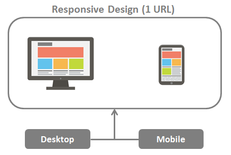
Responsive Design
Responsive design delivers the same code to the browser on a single URL for each page, regardless of device, and adjusts the display in a fluid manner to fit varying display sizes. And because you’re delivering the same page to all devices, responsive design is easy to maintain and less complicated in terms of configuration for search engines.
The image below shows a typical scenario for responsive design. As you can see, literally the same page is delivered to all devices, whether desktop, mobile, or tablet. Each user agent (or device type) enters on a single URL and gets the same HTML content.
With all the discussion surrounding Google’s mobile-friendly algorithm update, I’ve noticed a lot of people suggesting that mobile-friendliness is synonymous responsive design – if you’re not using responsive design, you’re not mobile-friendly. That’s simply not true. There are some cases were you might not want to deliver the same payload to a mobile device as you do to a desktop computer, and attempting to do so would actually provide a poor user experience.
Google recommends responsive design in their mobile documentation because it’s easier to maintain and tends to have fewer implementation issues. However, I’ve seen no evidence that there’s an inherent ranking advantage to using responsive design.
[Tweet “Responsive design is a great choice for mobile, but not the only option for mobile-friendly SEO.”]
Pros and cons of Responsive Design:
| Pros | Cons |
|---|---|
| - Easier and cheaper to maintain. - One URL for all devices. No need for complicated annotation. - No need for complicated device detection and redirection. | - Large pages that are fine for desktop may be slow to load on mobile. - Doesn’t offer a fully mobile-centric user experience. |
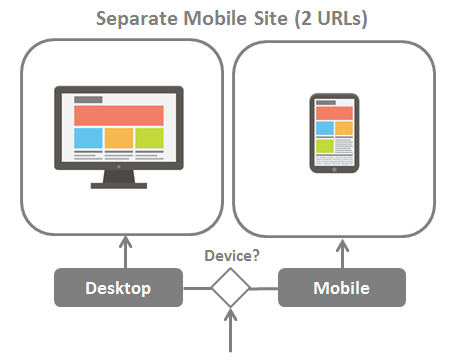
**Separate Mobile Site
**
You can also host a mobile version of your site on separate URLs, such as a mobile sub-domain (m.example.com), an entirely separate mobile domain (example.mobi), or even in a sub-folder (example.com/mobile). Any of those are fine as long as you properly implement bi-directional annotation between the desktop and mobile versions.
Update (10/25/2017): While the statement above is still true, it must be emphasized that a separate mobile site should have all the same content as its desktop equivalent if you wish to maintain the same rankings once Google’s mobile-first index rolls out. That includes not only the on-page content, but structured markup and other head tags that could be providing important information to search engines.
The image below shows a typical scenario for desktop and mobile user agents entering separate sites. User agent detection can be implemented client-side (via JavaScript) or server side, although I recommend server side; client side redirection can cause latency since the desktop page needs to load before the redirect to the mobile version occurs.
It’s a good idea to incorporate elements of responsiveness into your design, even when you’re using a separate mobile site, because it allows your pages to adapt to small differences in screen sizes.
A common myth about separate mobile URLs is that they cause duplicate content issues since the desktop version and mobile versions feature the same content. Again, not true. If you have the proper bi-directional annotation, you will not be penalized for duplicate content, and all ranking signals will be consolidated between equivalent desktop and mobile URLs.
Pros and cons of a Separate Mobile Site:
| Pros | Cons |
|---|---|
| - Offers differentiation of mobile content (potential to optimize for mobile-specific search intent) - Ability to tailor a fully mobile-centric user experience. | - Higher cost of maintenance. - More complicated SEO requirements due to bi-direction annotation. Can be more prone to error. |
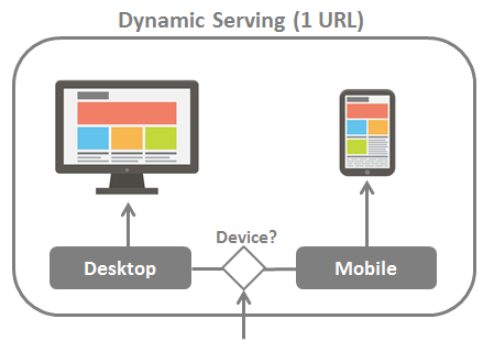
Dynamic Serving
Dynamic Serving allows you to serve different HTML and CSS, depending on user agent, on a single URL. In that sense it provides the best of both worlds in terms of eliminating potential search engine indexation issues while providing a highly tailored user experience for both desktop and mobile.
The image below shows a typical scenario for separate mobile site.
Google recommends that you provide them with a hint that you’re altering the content based on user agent since it’s not immediately apparent that you’re doing so. That’s accomplished by sending the Vary HTTP header to let Google know that Googlebot for smartphones should pay a visit to crawl the mobile-optimized version of the URL.
Pros and cons of Dynamic Serving:
| Pros | Cons |
|---|---|
| - One URL for all devices. No need for complicated annotation. - Offers differentiation of mobile content (potential to optimize for mobile-specific search intent) - Ability to tailor a fully mobile-centric user experience. | - Complex technical implementation. - Higher cost of maintenance. |
Which Method is Right for You?
The best mobile configuration is the one that best fits your situation and provides the best user experience. I’d be leery of a design/dev firm who comes out of the gate recommending an implementation approach without fully understanding your requirements. Don’t get me wrong: responsive design is probably a good choice for most websites, but it’s not the only path to mobile-friendliness.
Whatever your approach, the message is loud and clear: your website needs to be mobile friendly. Given that the mobile-friendly algorithm update is expected to have a significant impact, I predict that 2015 will be a busy year for web design firms.